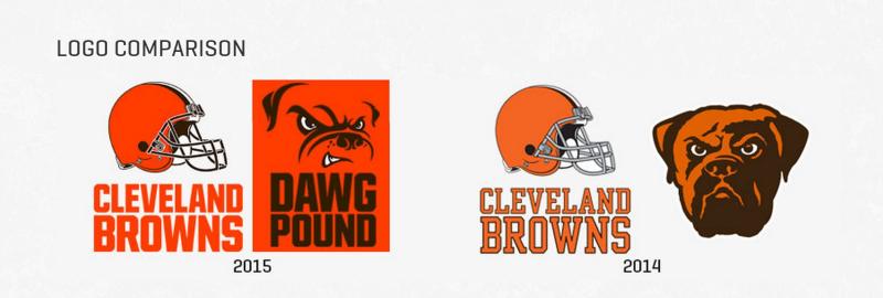
The Cleveland Browns unveiled their new logo today, and we really hope you weren’t holding your breath for this one, because at first glance, it looks exactly the same as their old one.
The official team release states that the revamped design is “a new orange color that matches the passion of the Dawg Pound. The new brown facemask represents the strength and toughness of Cleveland.”
How?
How does a brown facemask represent anything about a city, other than the fact that it might be dirty? Although, at least it’s brown, right? Because don’t you think a team that’s called the Browns, should maybe have, oh, we don’t know, a brown helmet?
Take a look and decide for yourselves, folks. 
[via NFL]

