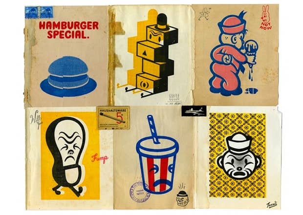

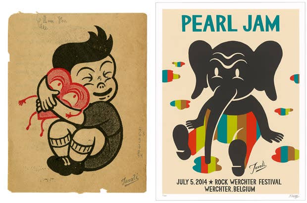
Few artists are able to create a balance between commercial work and fine art while also blurring the lines of both, but Canadian ‘pop art’ artist, Gary Taxali has built a successful international career out of it. This ‘blurred line’ helps him highlight consumer/ societal/ insecurities with a comical twist in his works. His work tugs at our heart strikes with references to nostalgia and makes us think through graphic juxtapositions. You may not know Gary’s work by name but you have seen it on concert posters, on Canadian currency, on toy store shelve, in high-end fashion retailers…. Recently, he was the focus of a documentary short that gave the viewer exclusive behind the scenes access into his studio. Complex caught up with Gary to learn more about his career as a Canada’s foremost ‘pop art’ artist.
Complex: How did you get your start?
Gary Taxali: I have been drawing my whole life. At the age of 4, my teacher wrote in my report card that I liked to draw pictures on my own based on the stories he like to read out loud in class. My father taught me how to draw and paint at an early age and my mother would encourage my creativity at home. When I was young, everything my canvas - books, desks, chairs, walls, tables, the headboard…everything. My parents and sisters encouraged me. My father would paint and I would watch him. I would keep asking him how to paint certain things and he would show me each time.
I started getting [outside] support for my art after I changed high schools and had a new art schoolteacher, Sharon Watson. She was the first teacher to tell me that I had talent; she even took me downtown to buy all the art school supplies that I wanted. She was the first real supporter outside of my family and has a real impact on my art and me. In fact, when she passed away, I did the eulogy at her funeral and felt I lost a family member
One day when I was in high school, my father took me shopping for art supplies and the cashier at the store suggested that I take night classes at the Ontario College of Art (OCA). I ended up enrolling and taking a night class there in the Illustration Program while I was still in high school. It was really great because, first of all, it gave me the inspiration to work on my art in a more serious manner than I’d ever worked before. Secondly, it was the catalyst for my decision to apply as a full-time student the subsequent year. When I became a full-time student, I already had a kind of advantage over the other students since I had already taken this class. I made friends with some upper year students who helped me out and gave me tips on how to break into the art world. One of the guys encouraged me to get my portfolio out there, so I took his advice and showed my portfolio to local art directors. I got my first job with Toronto Life magazine, in the summer between my 3rd and 4th years of school. By the time I started my 4th (and final) year of school I was already a working illustrator doing lots of illustration work. OCAD University has been a great starting point for my career and I recommended it for all artists. When I graduated, I already had a portfolio of professional work.
A year after graduating, I moved to New York City. This is actually when I got my start in the gallery scene. I was at a bar in the East Village one night and I met these local artists. There was one artist in particular named Thom Corn; he was this older, African American guy with dreadlocks who was friends with Jean Michel Basquiat and Keith Haring. He was really connected in the art world. He invited me to show my work in a group show he was putting together. I said, “I’m not an artist, I’m an illustrator. I can’t be in your show,” and he said, “Well, you’re an artist ain’t you?” and that’s how I got my start doing shows. He inspired me to start doing personal work. The New York East Village art scene had a huge influence on the start of my fine art and illustrating as a career getting me started professionally. My major influences were Andy Warhol, Ray Johnson, The Fleischer Brothers, the Russian Avante-Garde 1930s and 1940s packaging design, advertisement and typography.
1.
C: You were born in India and raised in Canada - how do you think the mash up of these two cultures has lead you to be the artist you are today?
GT: From a cultural perspective, I see it less as a mash-up and more so a natural flow of things. I didn’t grow up in a small town; I grew up in Toronto where people from all over the world always surrounded me. As such, growing up in Canada meant I was in a world surrounded by people of different ethnicities from different parts of the world. However, there weren’t a lot of Indians living here when I grew up. My parents really wanted to encourage the preservation of the culture by enrolling me in Hindi classes, speaking the language at home and taking trips to India. Having grown up in an immigrant family has framed a lot of my worldviews. Canada’s cultural identity was formed by people from all over the world, so in that sense I’ve always had a strong sense of belonging here.
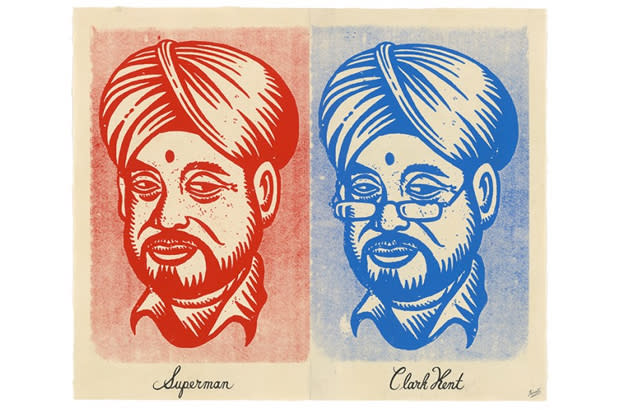
The artist I am today is framed by my Indian and Canadian heritage. My love for all things Indian (things like Bollywood, the music, spiritual things, and eating healthy Indian food) had a big impact on me. I’ve really been fortunate to have the best of both worlds. One of the things I tell people is that India is my birth mother and Canada is my adoptive mother.
2.
C: Your work seems to have many layers and many references to popular culture and other art forms. Can you walk us through your creative process?
GT: My creative process varies from project to project, but it always starts out with me sketching with pens and markers and brushes. I don’t like to use a pencil when I draw, or to remove the marks that I make. I like to stay committed to a line in a very confident stream of consciousness manner. Working in this way has not only let me shape my technical process, but also the conceptual process in terms of thinking on the spot and trusting my initial ideas.
From there, I will turn the sketch into a finished drawing, and it will end up being screen-printed or collaged. When I’m working on a painting, I’ll start with a few sketches, and build it up into a collection of sketches that form the basis of a more involved painting. I will take that really clean, tight drawing and transfer it really large in pencil onto a primed wood panel or canvas, because I would need to work in that manner in order to paint and build it up from there.
At that point I start thinking about colour considerations. A lot of it is experimental with the screen-printing process. And because a lot of what I do uses vintage papers and antiquated ephemera, I don’t really ever know what the thing is going to look like until it’s done. Sometimes it’s a disaster, and sometimes it works really effectively. One thing that I like is to constantly surprise myself. It’s that feeling of being on the edge and knowing that at any moment I could do a face plant and the whole thing could be a mistake. That’s where the honesty lives in art. It is the aesthetic balance between beauty and message, form and function, craft and concept – straddling that balance is imperative in all the work that I do.
C: Your work seems to always carry a social commentary but in a tongue and cheek way - is this something that emerges as you work or is it the beginning point of the work?
GT: I don’t think it’s one or the other; it’s both really. Sometimes the most serious messages that I’ve tackled came from not knowing where I was going, and letting my hand do all the work. The actual drawing of the picture frames the idea. Other times, though, I will really want to say something specific and I will think about the word or the phrase or the message beforehand and the artwork happens from there. In those kinds of cases, I’ll write down some of those key words so that my mind stays in tune to the message. But for the most part, I think the commentary is something that is dictated by the process. I don’t like to have a static way of approaching the idea, of having something emerge in a linear fashion. When you’re open to how it can happen, it happens in some of the most fun and random ways. I think every artist is excited about his or her work because we live in the surprise.
3.

C: Your work seems to fall mainly into two categories - the more mainstream commercial work and gallery driven works. Is this split real or is it only in the eyes of the audience? Is there much crossover?
GT: I describe my work as being in the realm of "pop art" combined with 1930s and 1040s style iconography and graphics with an aged, retro feel - it's this timelessness that allows me to straddle both the fine art and illustration worlds. I think the split is real, depending on the context of the work. Some artists have a completely different thing going on in their personal work than they do in their commissioned work, and I’ve never understood that. To me, your work is your work. Naturally there is going to be a difference in terms of message and what the image is going to consist of, whether it's a tangible extraction of a concept that makes sense on a commercial level or something more personal. Right away, that is apparent to the viewer.
Something that few artists do is to not make any distinction between their fine art and commercial art. However, by not making a distinction, my fine art has helped my illustration career and in turn my illustration has helped my fine art career. The result is that a lot of the projects that I do are less the type of projects where I am being asked to be a “pretty picture maker” for somebody else’s vision, but rather I’m being asked to create a picture as an artist with a point of view. It’s still commercial, but I’m being hired as an artist. For example, once I was asked by an ad agency to create an ad for Converse. They said they didn’t want to see any sketches; they just wanted me to do a piece of art. They didn’t even want me to draw the shoes. They said they would use it no matter what. When the ad went out, they had my name and a little bio about me on it. So that kind of thing is illustration as fine art and fine art as illustration.
I’ve consciously blurred the line between fine art and illustration by just doing what I love.
4.
C: In the past you have worked on coins for the Canadian Mint, vintage inspired toys and now pocket squares. Why fashion?
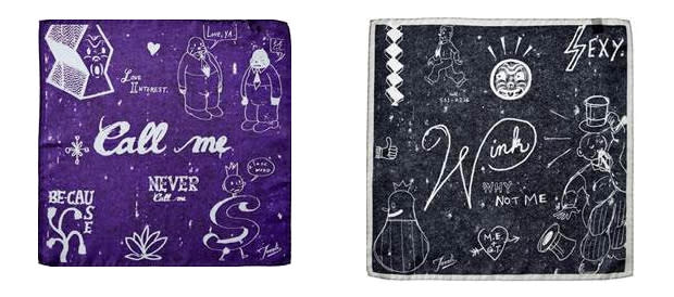
GT: I had never seen myself as a fashion designer, and I still don’t. My art agent Vandana Taxali, suggested I do them as an extension to my work to make it more accessible. She approached me to create a series of themed silk pocket squares for Harry Rosen. All the folks at Harry Rosen have been wonderful to work with; giving me complete artistic freedom. The first collection which released in Fall 2013 were pocket squares based on Canadian cities, Toronto, Montreal, Vancouver and Calgary as well as one featuring Canada as a whole. The following year in Fall 2014, we released the second collection entitled, "The Art of Flirtation". It's been a joy and great to see people frame art as fashion showing that art can be fashion and fashion can be art. As my sister describes it, fashion is wearable art.
So what’s up next for one of Canada’s most prolific artist: OCAD’s Project 31 Art auction on March 27th; an exhibition at the Idea Exchange in Cambridge, ON from July – September 2015; a solo exhibition at Jonathan LeVine Gallery in New York City in November 2015; some more public art installations for the City of Toronto’s StreetARToronto initiative.
Above: Gary Taxali: The Art of Whimsy, produced by Kyriakos Alexopoulos and Ryan Walker, recently screened at Annual Reel Artists Film Festival in Toronto.